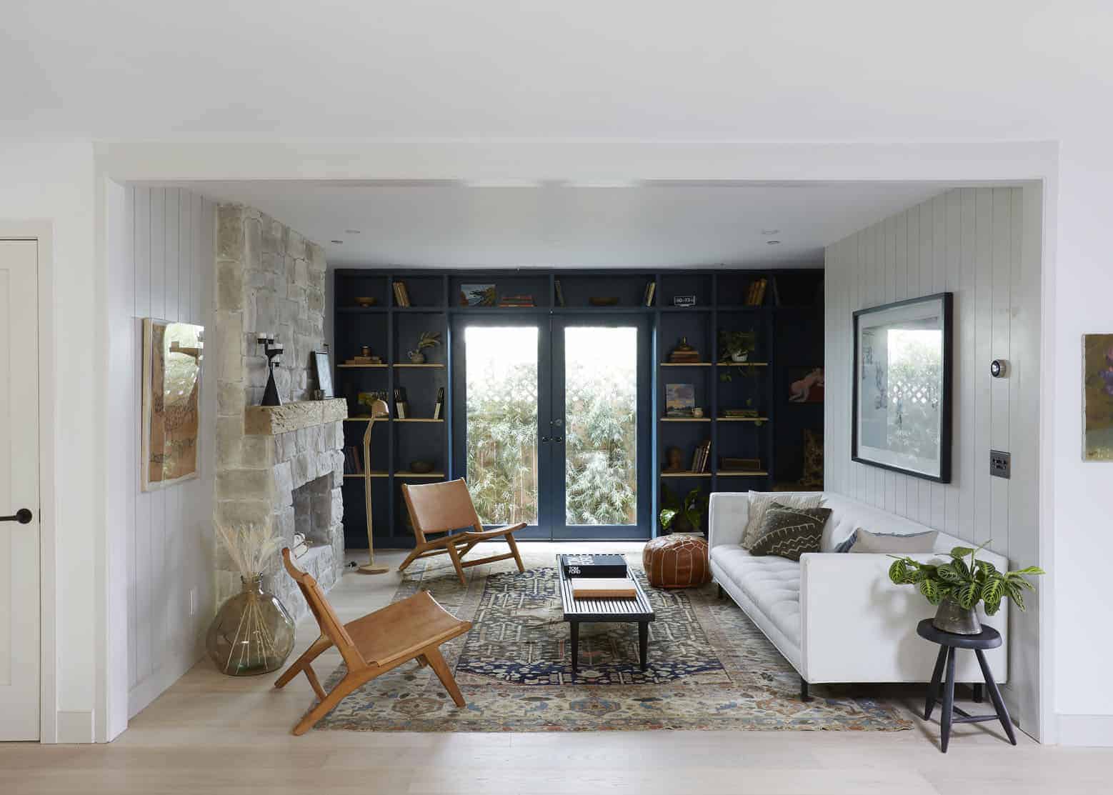
Ithink that small reno or “update” projects are on a lot of our minds since the weather is nice (read: already extremely hot) and these types of projects help to keep boredom at a minimum thus sanity at a maximum. Thoughts like, “How can I make my home feel more special?” or “What are some easy ways to add character?” have likely been floating around your brain. And to be honest there is A LOT you can do if you are willing to pick up some tools and get to work.
Last week we showed you Alison Pierce’s stunning home where she mostly worked with what she had when it came to updating. And while there are SO MANY tips to take from that post, she also had the blessing of a home filled with endless architectural vintage charm. But what if you live in a new build (like this one originally was in 2019) or your older home just doesn’t have those special details? You create them yourself. I know sounds intimidating but it’s SO worth it in the end.
With that said let me introduce to the very talented Shanty Wijaya of Allprace, the developer and designer of this incredible home you are about to dive into with me. She purchased it with the intent to give it some real soul, more usable square footage, and then sell it to a lucky buyer (With the help of our favorite staging company A 1000x Better. Remember this Craftsman they also staged?). So when I was looking at the photos of this home I thought to myself that there are A TON of great ideas for people who want to upgrade their homes beyond some new furniture and maybe tackle a reno project. So let’s start this house tour and get you inspired to use some power tools (or just a paint brush:)
MIX UP THE PANELING ORIENTATION
One of the first things that caught my eye was the accent paneling and that Shanty chose to install all over the house. We are huge fans because it just adds instant architectural character. But what she chose to do (that I LOVE) was to keep it visually quiet with the light warm gray paint color. It feels like a secret. Like you don’t know why it feels so cozy despite the mostly light-toned neutral palette.
Now the main sneaky yet genius detail (and the real point of this “idea”) was that she mixed the orientation of the paneling in the same line of sight. I mean talk about a perfect way to have the traditional feel of paneling in a modern way. It feels fresh and keeps your eye moving while also helping to “separate” and designate each room in this open plan.
